Wednesday 26 March 2014

The Importance of Title Design in Film Making & Other Media

After watching a video about title design  I gathered an understanding in how important the initial title sequence is to video productions. For a TV series it's important that the title sequence accurately reflects the mood of the production. For example in Mad Men the title sequence highlights some of the important elements of the show such as it's setting and culture, this technique can somewhat be translated for other media productions such as websites and logos as the choice of font can have a significant impact on how the media artifact is absorbed by the audience.
In the movie "Zombieland" the text which is used to introduce the cast and crew in the title sequence is also used throughout the film as a sort of narrator character, so the role of text in this movie is rather significant.

For TV shows such as Game of Thrones the title sequence is used to guide the audience through the setting of the series. The camera navigates the audience through a 3D generated map showing all of the key locations in the story. This title sequence adds a sense of scale to the narrative of the show.

The title sequence can also take the form of a metaphor in which the narrative of production is exaggerated in an illustrative way. This technique can be useful for introducing an audience to deep thinking drama productions as a metaphorical intro can aid the audience's understanding in the understanding of the subject.
An example of this would be David fincher's "Girl with the dragon tattoo" in which the title sequence was made up various 3d generated sequences which were suppose to replicate memorable parts from the book series.
So although visually stunning this title sequence would likely not be understood by an audience which hasn't read the book.

Development of 2D Music Animation

A few weeks ago I created a 2D animation which I synced with some music I made in StageLight. Which was very basic and had elements of repetition as well as dynamic elements. I wanted to expand this project and concept into a more visually stunning composition such as 3D rendered one which has a similar process of development.


I have now expanded this project into a 3D animation made in Blender. In Blender there's a nice tool which automatically synchronizes animation movements with the waveform of a piece of audio, so you end up with a perfectly synchronized composition. Each of the squares has their own audio track linked to them as the piece of music I created was saved not as a single audio file but as lots of different tracks (instruments).

This tool makes it perfect for making audio visualization similar to that of  Mathias's "Entering the Stronghold" piece


Potential workflows for me to use in future could consist of initially creating the audio piece in StageLight then import this into Blender and create a transparent composition which you could then import into After Effects to add video effects. 

This workflow would be good for designing a digital music video or intro sequence for trailer such as the ones shown below.


I would of developed this composition further by building on the Gesalt theory which states that people subconsciously put visual elements in categories made up of shapes which are similar. When applied to my composition this would suggest that its perceived as a single visual element which could mean that's its less visually interesting than the 2D composition. So I should of included various different shapes and effects to make it more interesting.

http://graphicdesign.spokanefalls.edu/tutorials/process/gestaltprinciples/gestaltprinc.htm


http://www.instantshift.com/2011/09/19/the-close-relationship-between-gestalt-principles-and-design/

Monday 24 March 2014

Inspirational Web Concepts

One of my favourite websites which I used to go on a few years ago was a website called "SocialVibe which was basically a digital advertising company which donated money to a charity chosen by the user when you complete various activities. For example the activities ranged from completing surveys to sharing advertisements to your friends.

It's basically an advertising technique which encourages users to get involved as the whole concept of giving to charity is somewhat cathartic. As a result the site got thousands of users and there was almost new brand endorsements every week as the site became more popular.

For the advertiser it became a platform in which to gather primary and quantitative research about their audience, so the whole process is a somewhat win,win process for both the advertiser and audience.

I really like this approach to advertising and in my opinion it makes your audience less passive than they would be with traditional advertising methods.

This concept has started making me think about other ways in which I could somewhat replicate this process with other digital interactive artifacts.

Saturday 22 March 2014

Reflection on my work and practice

Recently I have been experimenting with various pieces of software creating mini projects which demonstrate my understanding in how to use that software however some of these projects don't really reflect my personal belief in what it means to be Digital Media Designer. When I develop a project I like there to be clearly defined narrative to the project and it's my role as a Digital Media Designer to develop a somewhat cathartic platform in which to convey the text of the project to the target audience.

This personal practice which I abide by is evident in some of my work for example in my Charity Flash Banner where the project's message is packaged in a digital interface which aims at conveying mixed emotions in the audience. The emotional transitioning in the audience is major factor in the design of the banner and it's technique I will hope to repeat in my future projects.

It's also very important for me to take in mind the ethical considerations of my work as particular topics may offend a particular religion or social group. Some other design considerations which I should take into account when designing a project is its overall compatibility as well as if there are any health and safety risks associated with the content for example any flashing effects may induce a photo-epileptic seizure. 

3D Collaborative Project Result and Review

I tasked myself with trying to create a 3D composition which utilized various 3D software. I decided to create a Kirby looking character in Sculptris and then export him over to 3DS MAX where I made the rest of the composition.


The shape wasn't very complex to make as the sculpturing tools used in this software I found rather easy to use and there's only nine tools to learn. I initially started with sphere shape then inflated the side of it to make his arm. This software has a line of symmetry active as default so it enabled everything to look the same either side of my model, this is a very useful feature when modeling complex symmetrical shapes such as faces.

The whole reason for this software collaborative project is for me to see if this is viable workflow for me to use in the future, as I'm expecting that some things will be lost when I export it to 3DS MAX.

Overall the export was pretty good and my mesh looked pretty much the same as it did in Sculptris however one thing which I did notice didn't carry over was the material I assigned it in Sculptris. As you can see below I've applied a gold texture to my Kirby model however in following image which shows the model exported into 3DS MAX you can see that the material is lost.


Now that I successfully imported my model into 3DS MAX, I  then create a 3D background using 3DS MAX tools which will be to scale with my Kirby Model.


3D Collaborative Software Project

Now that I have some technical understanding with various 3D software I'm going to attempt to create a mini project which utilizes multiple pieces of 3D software. While learning to use the 3D software i'v learnt that some excel at particular tasks more than others. For example i've learnt that "Sculptris" is particularly good at making complex meshes and in my opinion is better than 3DS MAX and Blender in that particular task however Blender and 3DS MAX are better at implementing lighting and modifiers to 3D compositions.

I'm going to try and create a 3D composition which consists of elements produced using two different pieces of 3D software. This will enable me to test if this is a viable workflow for me to follow in the future as well as i'm expecting some problems to occur in the import/ export process.


Friday 21 March 2014

Completion and Reflection on Flash Banner Project

Recently I have been in the process of creating an interactive Flash Banner which would promote a charity, I conducted research into other successful Flash Banners and have adopted their techniques in the design of my flash banner. I used a screenshot of the Ebay homepage in order to simulate it's positioning when it's actually hosted.


 I'm overall very happy with how my Flash banner turned as I think it's eye catching enough on the ebay page to grab the attention of ebay shoppers. I've implemented various dynamic effects such as a dynamic underwater background, custom cursor and dynamic  transitions between pages. One thing which I could improve on in future, is my use of space in the micro-site as I think i've got too much free space on the site which could of been used for more content or external links to useful sources. I believe I developed the flash banner sufficiently enough that it will appeal to my desired target audience which is basically a browsing e-commerce audience who are more likely to part with their money while in an online shopping spree.


I enjoyed making this project as it required me to use various adobe software, Photoshop, After Effects and flash, collaboratively to make the desired design I wanted. I enjoyed this particular workflow as I had a clear understanding in how to implement everything and this is probably a common workflow used in industry.  


Monday 17 March 2014

Flash Banner Research

Before I begin designing my banner I must first conduct research into other banners and in particular “Charity Banners” .  I will clearly explain various elements of an ad such as the use of font and why it’s positioned where it is as well as the use of images and dynamic effects.  I will also explain the key traits which make the website appeal to a particular audience, these can be traits such as color scheme and font.


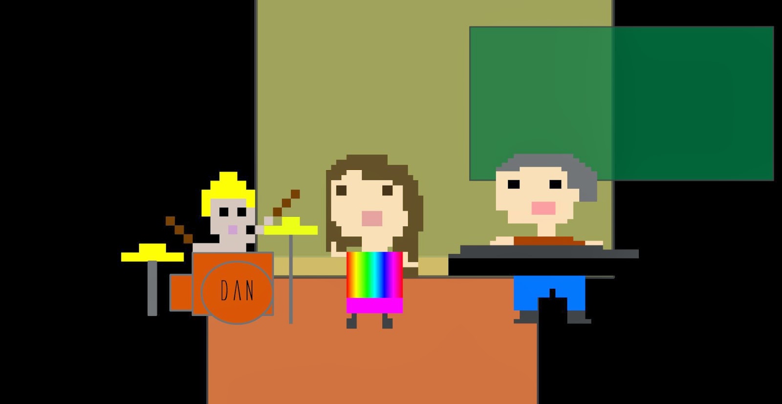
In this interactive banner it basically consists of a still image of people playing in a park with casual clothes on but once the user scrolls the mouse cursor over the banner a phone follows the path of your mouse cursor transforming the image through the view finder. 
This kind of banner would appeal to people who are interested in sportswear so the ad has a clearly defined target audience. The banner also has some cool mini effects for example adding a scoreboard above the goalie when you scroll over him, this reminds me of an interactive installation created by Chris o Shea called "Out of bounds" in which a user moves a torch around in front of a projection which enables them to see through a virtual wall.

The utilization of that particular mechanic in the banner would lure in the audience as it requires interactivity and isn't like a convention ad.
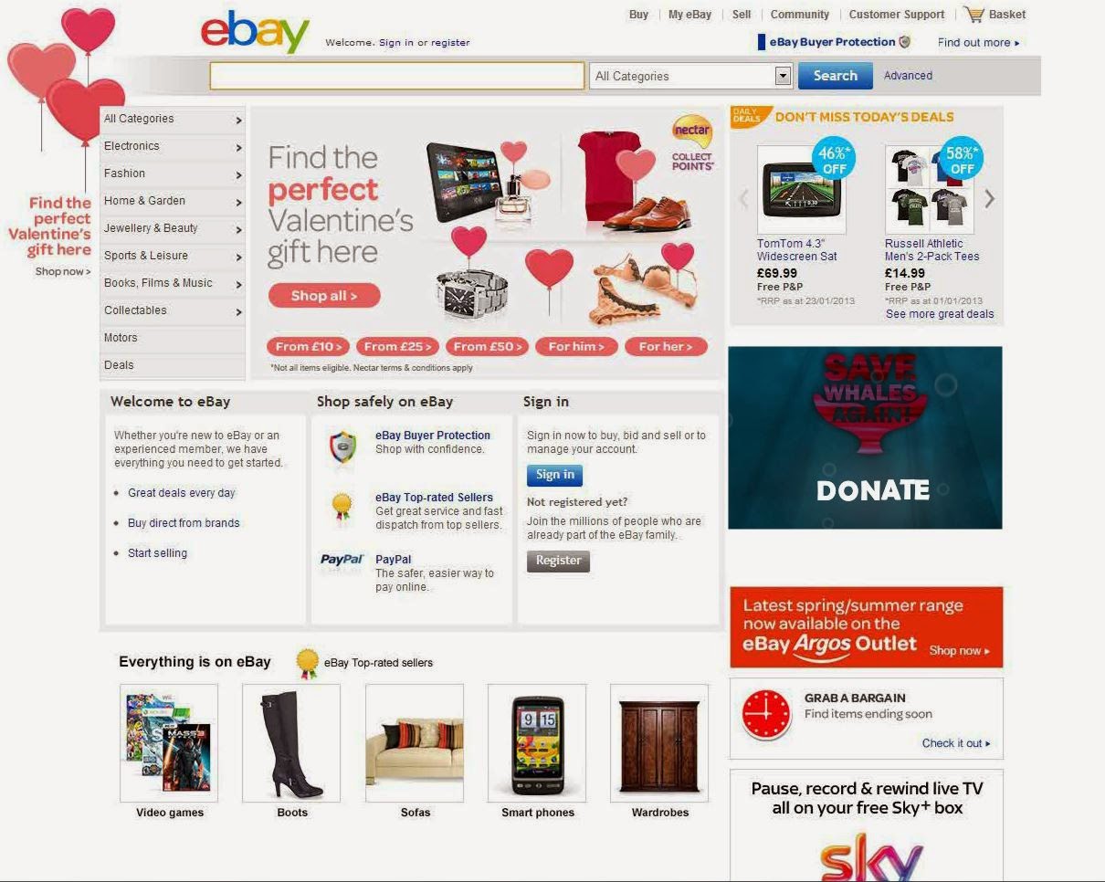
I've also done some research into micro-sites which are basically a mini webpage which opens after you interact with a banner. The website “Socialvibe”  has loads of micro-sites which have mini-questionnaires for users to input their opinions on particular things.
simonmainwaring. (2011). SocialVibe: How advertising and social media can change the world. Available: http://simonmainwaring.com/social-networking/socialvibe-how-advertising-and-social-media-can-change-the-world/. Last accessed 17th March 2014.

Here are some examples:


Some of the key traits of this micro-site are the huge logo which consumes about half the page.   This is so that the audience knows what is being advertised. The page also contains a video which is basically a promotional trailer.  The micro-site also contains some interactivity in the way of a questionnaire.

One of the initial ideas I had for this project was to have a micro-site expand from a banner, so researching key traits of a micro-site was very useful.


My initial banner would have a design very similar to this banner. The banner would consist of a minimal amount of text as well as a button which would launch the larger micro-site. The banner would utilize a dynamic transition to the micro-site as well as some moving objects.  The micro-site will need a pre-loader as the microsite would have a video and large files such as videos and high resoultion  pictures normally slow down a webpage significantly or become unresponsive in some browsers. 

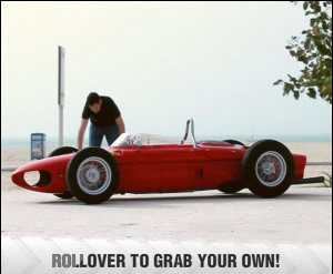
In another banner which I found the banner consist of a looping video of someone washing a car but once the user scrolls over the banner a hand picks up the car, the trigger for this video is a rollover action by the user.  I don’t think I’ll use a rollover action for my animation as my banner will launch a mini webpage with its own interface, therefore if my webpage launched with a rollover function it would get rather annoying to the user. A simple “on-hit” function would be a better trigger as an “on-hit” function which requires a user’s input won’t spam the user unnecessarily.


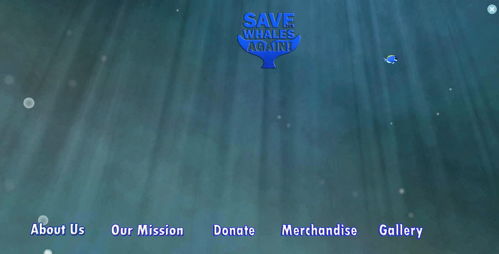
I took a lot of inspiration from the old Socialvibe interface which featured various charity’s here’s an image of the “Whaleman Foundation” page


Research into Construction and Coding in Flash


From the tutorial shown in the following link I’ve learnt the basics of creating a flash banner in flash.
The tutorial explains things such as creating an invisible buttons which when clicked on would launch an external site. This is most common way of making a flash ad banner which basically involves making the whole interface of the banner a button. However I personally think that, a flash button which only uses that method and has no dynamic visual effects is very boring and therefore will likely be ignored by browsing customers. With this in mind I will try to make my banner capture the eye of as many users as possible.

Ways to Capture my Audience


Some of the ways in which I can make my banner appeal to as many people as possible Is by implementing things such as sounds, animations and good use of fonts.
Adding sounds effects to components such as the buttons would likely capture the attention of users which are panning their mouse cursor around the page. Another way in which you can capture your audience is by having a clear distinct logo for your banner, if the banner looks professional it is more likely to be interacted with by the user as there are many banners on the internet which are there to con users into revealing personal details such as their email address ect.
It’s important that the graphics, fonts and color scheme of you banner follows the same particular theme throughout as this is important to capture your target audience as well as maintain a professional persona. If you use bright vibrant colors throughout your banner this wouldn’t really appeal to older people.
As my banner is slightly different from traditional banners because my banner is for a charity so I need to influence the audience on an emotional level.

Human Computer Interaction: Use of color


The overuse of color may result in the banner being harder to understand as color is essentially information and the overuse of color can cause confusion. I would initially design my banner with no color and focus primarily on the navigation and functionality and add color at the end to add effect.  
I browsed youtube for tutorials into how to make flash banners and one of the tutorials which I watched was how to add HTML code to swf files. The reason I did this tutorial was because it’s important that I know how to scale change various parts of the swf when it’s viewed in a browser.  


The tutorial which I completed enabled masked parts of a banner to remain hidden in a browser until it is rolled over;


This was a very useful tutorial for me as I’m planning on having my banner expand into a full page interface or micro-site. I will keep the HTML file in my project file and implement it into my finished banner.  For more detailed explanation on the development of this tutorial please refer to the development section in this document.
I also conducted some research into flash transitions as my flash banner will dynamically change into a different state. Some of the best transitions can be found in flash galleries so I browsed the internet for sample code for these galleries so that I can implement such transitions in to my banner.
In the gallery displayed in this link it has 18 different transition effects which it randomly makes when changing image.

Cyber-society

In the 21st century society is more dependant on technology than its ever been, an individual's smart phone plays a significant role in how about people go about their daily lives. The smart phone has evolved from being a very linear single purpose communication device into a device which functions much like a computer which can perform various tasks at the same time.
It can be argued that the emergence of mobile devices has caused a decline in the demand for desktop PCs as the concept of having a mobile device is more appealing to the majority of people.

One of the most significant technologies of the 21st century must be the world wide web. The world wide web is a platform in which people can share knowledge and it can be argued that you find information on almost anything on the web which in the pre-digital age you would normally need to look in a library for. As most digital devices have access to the web this enables people to have access to this huge database of information as well as access to live streaming information.
Social networking sites are very significant as for some people sites such as Facebook and Twitter consume most of their time online. Social networking sites act as platform in which you can communicate with a virtual community created by the user, it can also be used as a platform in which to communicate with people the other side of the world which wouldn't of been possible otherwise.

It can be argued that we have almost become cyborgs in which our reliance on technology is so great that its believed that  having access to the internet is an optimal human state as you have access to a whole host  of useful information and communication tools.


Sunday 16 March 2014

Working with Flash to make Animated Banners

In my previous blog entry I talked about the output capabilities of Adobe After Effects and how I can easily integrate the compositions into other projects. In this project I will be creating a flash banner which will expand into a fully functioning flash micro site. The dynamic banner will need to be visually appealing  so that it grabs the audience's attention as it will be competing with other content on the webpage. A common place where you would find flash banners would be on e-commerce websites like amazon or eBay so its very important that you make your add stand out from the rest.

For this project i'm going to pretend that I have real client and they want me to create a banner which will encourage people to donate to their charity. The charity I have chosen is called "The Whaleman Foundation" which focuses on preserving the ocean habit. With this in mind my Flash banner will have have an ocean/underwater theme to it.

I then now conducted some research into after effects tutorials which simulate an underwater environment such as this one . Lawrence Grason. (2012).


In this tutorial Lawrence undertook a similar process as Andrew did in my previous entry however Lawrence has a slightly different technique in which he manipulates the settings of some of the preset effects. For example Lawrence applies the snowfall effect to his composition but then inverts the trajectory of the snow so that the snow is now travelling upwards like bubbles do underwater.


In an article by Rebecca Creger I learnt about some of the basic elements to consider when designing banner ads. The maximum size for banner ad is 600 pixels and its very important that within that space you convey the following things; A company logo, what your company offers and a call for a response from the user.

The design shouldn't be too cluttered so it's important that when I design my banner my composition should  have too much going on which may confuse the audience.


Rebecca Creger. (2013). 14 design tips for more clickable banner ads.Available: http://99designs.com/designer-blog/2013/10/14/14-design-tips-for-more-clickable-banner-ads/. Last accessed 15th March 2014.

After Effects Project 2 Completion & Thoughts

I completed the glass text composition project and i'm pretty happy with he end result as I think I was able to replicate the techniques used in Andrew's tutorial  and i've gathered and understanding of these techniques that I can apply them to a future digital media project. The render options in after effects means that I can output my composition in various different formats as well as output them as an animation sequence for use in flash, in movie clips for example. I will now undertake some testing in Dreamweaver to see if the video works well as a video background and if it does I will likely implement other video background on my other pages however I need to consider whether this would hinder the stability of my website.


After Effects Project 2 Interpretation & Progress

As I worked through the tutorial I got a clearer understating on how adding simple effects and blending options can change the way in which a composition is interpreted by the audience for example if I remove all off the effects and blending options from my composition it simple looks like cloudy text.


However when I add effects such as displace it gives my composition a rough pizxely outline which somewhat looks like glass.


Managing the opacity of your layers is also important especially when your ant to make a glass effect in your composition. In my composition I have various bright layers behind the glass texture in 3D space however with the correct opacity settings and blending settings I can make them somewhat shine through the glass texture which is the same as the natural process. 


To establish a focal point in my composition I used a circular mask which highlighted the center of the composition where the text would be. I also think that the use of the mask layer complimented the lighting effects as well.


So far I've managed to replicate some of the techniques shown in Andrew Cramere's tutorial.
Andrew Cramere. (2013). Translucent Glass. Available: http://www.videocopilot.net/tutorial/translucent_glass/. Last accessed 14th March 2014.


After Effects Project 2 Description & Analysis

After working with after effects when making the typography project i've decided to expand on what i've learnt by attempting to make a more advanced composition.

While browsing the web for useful tutorials I came across the site Video Copilot which had lots of interesting tutorials. One tutorial which got my focus was the Translucent Glass tutorial which I thought would look good as a video background on my portfolio. 


 Cramere (2013) uses various technique techniques in his composition which give the visual impression that the text in his composition is behind a solid glass texture. However his composition is filled with lots of objects with their own light emission and most of the objects have been converted to 3d objects meaning that when the virtual camera rotates around the focal object reflections pass through the text differently than if it was a static 2D object.

The text in the composition is duplicated and lined up very close to each other however one version of the text is heavily blurred to give a thick glaze effect to the text to seem like it's behind solid glass.


I'm going to try replicate the process done by Andrew Cramere (2013) in this tutorial but change it slightly so it's suitable for my website. Andrew Cramere. (2013). Translucent Glass. Available: http://www.videocopilot.net/tutorial/translucent_glass/. Last accessed 14th March 2014.

Thursday 13 March 2014

My Introduction to Blender

I have recently started using Blender to create some 3D compositions, it took me a little while to get familiar with the interface as the interface looks a bit daunting when you first open the program.


It has a somewhat similar looking interface to that of 3DS MAX however navigating the 3D space in Blender is controlled comply by the mouse whole on 3DS MAX you have a mini cube located at the top right of the stage which you use to rotate your composition.


During my first time testing the software I identified one particular thing that Blender does much better than 3DS Max which is 'Text'. In Blender it is very simply to add 3D text to the stage and map to how you want it. 

I haven't been able to create 3D text in 3DS Max yet however the process is so simple and easy in Blender I will likely just prioritize Blender in my workflow for a project which requires 3D text while I would use 3DS Max to design more complex 3D objects such as houses or complex shapes as I'm slightly more confident with 3DS MAX at the moment. 

My next task will be to create higher quality renders so that I get an understanding how detailed you can make your renders.

During a workshop I was shown a short film which was created completely from the Blender software. Video
 

Wednesday 12 March 2014

Completion Of Typography Task

I completed the 15 second typography task with relative ease once I was able to learn some after effcts shortcuts which sped up my workflow. I was initially working with one letter at a time and adding effects to them individual which was quite a time consuming process as It took my about 2 hours to complete 3 seconds of the typography. However with this in mind I  decided to approach the task slightly differently by just inputting all of the words within the 15 seconds on separate layers and not adding effects to them. Once I had done this I then manipulated the text in the timeline so that they appear and disappear at correct times in the timeline.


I then added key frame effects to various words in the composition for example adding a 360 rotate animation to the word "spinning" and a vertical animation to the word "Down"


Once the typography was done I could then add effects, the way in which I did this was by selecting all of the text by holding down Shift and then adding a effect from the effects panel which after a brief loading process applied the effect to all of the text. 


  This different approach to the task greatly increased the rate in which I completed the task and is a process I will likely repeat in similar after effects tasks in the future.


Sunday 9 March 2014

Gravity Motion Typography Task Progress

I've started working on my typography project and have managed to complete 5 seconds of the trailer so far. i've managed to implement some background visual effects into my project which in my opinion makes the project look a lot better visually. For example I added an effect to the background which gave the illusion that there's space debris passing through space which makes the composition seem more dynamic than if I just had  a still image. This visual effect is repeated throughout the composition so I only expect it to get the interest of the viewer for a few seconds which is important as the main visual interest in the composition is primarily the text.

 I probably should of started working on the effect after I have done the initially typography transitions however I decided to just implement effects as I thought of them.


Friday 7 March 2014

After Effects Project

My next mini project involves the use of Adobe After effects as I'm required to create a kinetic typography piece. The piece of media in which I must overlay with typography is a movie trailer which shouldn't be too hard to do as they're only a couple of minutes.

I have browsed the web for useful tutorials which demonstrate how to create a kinetic typography piece. From what I've watched so far it's mostly a process which involves constantly previewing your work to ensure that you have synched the text with the dialogue correctly.

This task somewhat reminds of the 2D animation task I did at college where I had to match my animation to a movie trailer.

This task gives me an opportunity to develop other after effects projects I have started in the past which I could also put in my portfolio as I've dedicated a whole page to after effects projects.

Thursday 6 March 2014

Portfolio Website Hosted

I have completed the revamp of my portfolio website to a satisfactory standard which I think is suitable to host. Here


I have laid out my portfolio page in various sections , Projects, Individual work and CV. This makes it clear to visitors what my skills are as well as my interests. All of the pages function correctly and the project is relatively easy to update when I want add more work.


Sunday 2 March 2014

Weekend Portfolio Progress

Over the weekend I have been working on the "My Work" page of my website and have almost finished the page. I have added screenshots of various pieces of my work and happy with the design and layout of my work. I will be adding links to the screenshots which will redirect users to separate pages with rich media content such as videos and flash files. If I dumped all of the flash swfs and videos on a single page it would result in the page taking a long time to load which wouldn't be a very good user experience.